Well it’s been quite the year,
I figure since it’s the last day of 2020, the year where many fortunate Americans traded in their office/business attire for ‘athleisure’ wear; what better brand to spotlight than the one that practically coined the phrase.
I’m prefacing this edition of ‘Evolution of a Logo’ with the following: This post is full of my own personal speculation and opinions and quite possibly will need to be edited and retracted at some point in the future.
Not much is known about the lululemon name and logo. This hugely successful company is rather secretive about the development of their identity.
The story goes that the founder, Denis ‘Chip’ Wilson of Vancouver, presented 100 people with a selection of 20 names and ‘lululemon’ was chosen. But the logo was really the intended mark for another name ‘Athletically hip,’ which obviously wasn’t chosen.
Are you kidding me?! One of the most successful brands of modern retail created this crucial aspect of their brand… like that? For a company that makes exercise wear, that just seems a bit rash and kinda lazy to me. Someone should explain to them what a real branding exercise looks like.
Here’s the mark in case you’ve missed it.

I’ve heard the following theories behind it:
It’s a stylized version of the omega sign.

I can certainly see it, but why?
Lululemon did start out as an exclusively women’s clothing company. Is there some misogynistic, hidden meaning? It’s possible. Keep reading and you’ll learn why.
It’s the outline of a uterus.
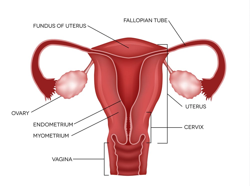
A uterus?
I mean maybe, if someone who doesn’t have one drew it.
The letter ‘A’ (for ‘Athletically Hip’ I guess) with a classically feminine hourglass shape

This seems a bit more plausible to me.
Again, shaking my head, tragically lazy.
Or maybe a silhouette of ‘The Rachel’
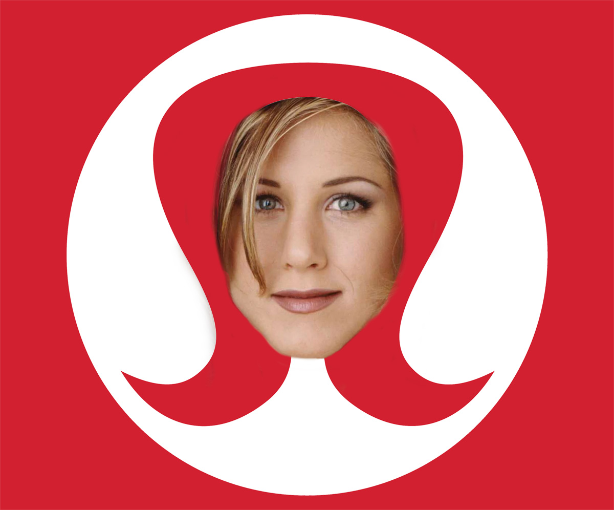
Truthfully, this is the first thing I saw, and what I have always thought it was supposed to be before I started doing my research. Or maybe, upon closer inspection…
Two lowercase l’s (back-to-back) for lululemon, but that’s technically three l’s.

It also looks a helluva lot like the design on Mick Jagger’s t-shirt from a 1969 Rolling Stones concert.

Maybe Denis ‘Chip’ Wilson is a Rolling Stones fan and totally knocked off the design?
Ding, ding!
Who knows, but whatever your interpretation is, it’s undeniably feminine looking.
In my opinion, it’s safe, boring, completely conventional in the worst possible sense, and lacks any semblance of real meaning. The very opposite ideology of what the company is trying to portray.
More thought provoking to me is the elusiveness of the logo on its articles of clothing. Quite small, and often placed on a calf, shoulder, lower back or pelvis, you actually have to go looking for it.
Take other athletic clothing manufactures, like Nike (the swoosh), Adidas (the three stripes), or Under Armor (the interlocking U and A), their logos are typically big, bold and the center of attention.
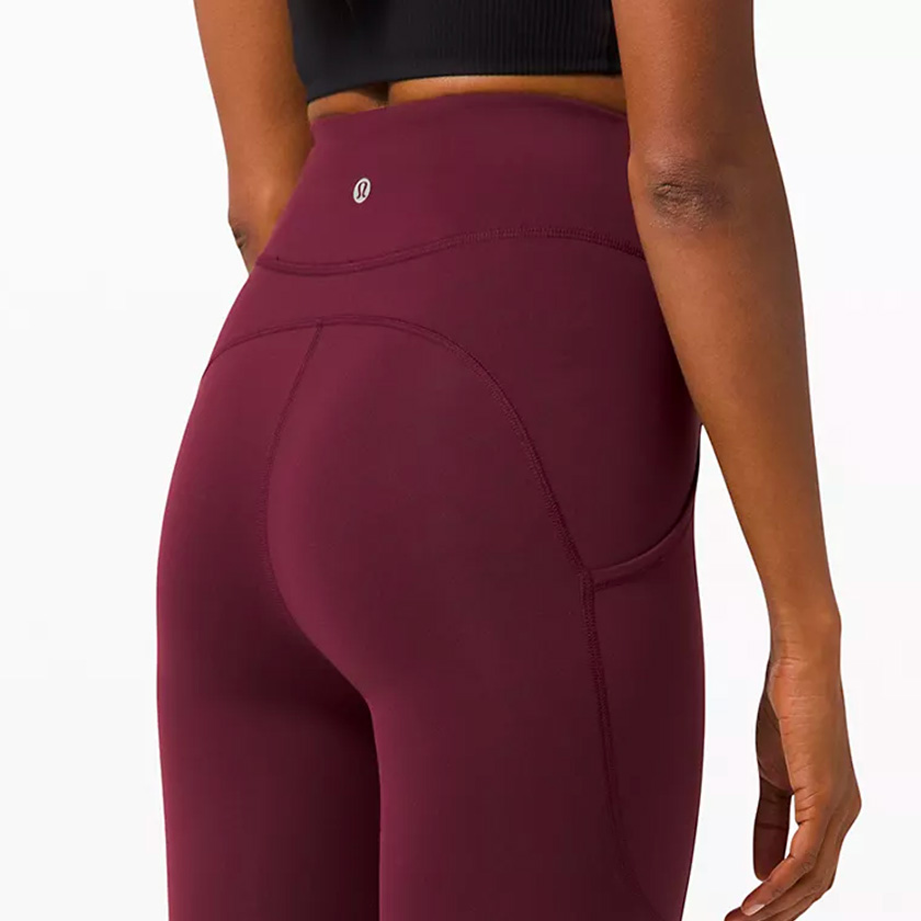
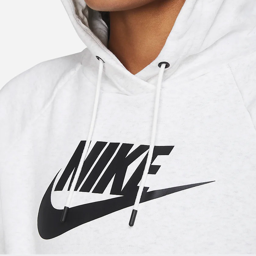

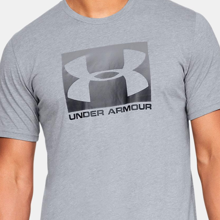
Ballsy, right?
…and rather seductive.
It’s a distinction that shouldn’t go unnoticed, and I applaud lululemon’s designers for their discretion. If you follow my blog, which you don’t, but if you did, then you would know I’m a big fan of subtlety. Classy, I’ll give them that.
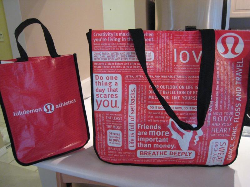
The packaging and shopping bags, on the other hand, scream,
“Look at me! I just shopped at lululemon…
… I can look like I do yoga, without actually doing yoga!”
The bags are intense, you’ve seen them with all these wannabe-inspirational-but-more-patronizing type messages on them like,
‘Friends are more important than money.’
But I need money to buy these $100 leggings.
‘Do one thing a day that scares you.’
Yep, never heard that one before. So you’re telling me if I go pet a snake today, all my hopes and dreams will come true?
‘Jealously works the opposite way you want it to.’
Okay, that one is actually pretty good.
Ironically enough, these bags filled with messages about being healthy, were recalled in 2010 because they contained high levels of lead in them.1
So if you’re a bag hoarder (wink, wink… you know who you are), and you still have a lululemon bag that predates 2010, you should probably go ahead and dump it… might want to put on some rubber gloves first.
I know, I know… I’m sounding incredibly cynical and pessimistic. Maybe I’m letting my knowledge of Denis ‘Chip’ Wilson’s reputation and his rather controversial and distasteful comments about women’s bodies and what type of women’s bodies his apparel is made for tarnish my opinion of the brand?
But in my defense, according to his website, his purpose is-
To elevate the world from mediocrity to greatness for 20 – 40 yr olds via transformational development in technical athletic apparel.
~ Chip Wilson
Barf.
So if you are over 40 I guess ole Chip doesn’t make apparel for you either.
Why are so many men who are highly successful entrepreneurs such d-bags?? That’s a whole other topic though, for someone who is much more qualified and well-versed than me, to tackle.
Maybe sometimes… most of the time… it’s not about the ridiculous, hard-to-pronounce name… or about the douchebag ceo with bad press… or about the logo at all… Maybe, at the end of the day, all us consumers really care about is the Luon fabric that makes our a$ses look so good?
Fair enough, but it makes me a little sad. It’s probably good that most of society doesn’t obsess over logos and branding as much as your average graphic designer does. While I do appreciate the opportunity to rant and rave about logos, that’s not the sole purpose of this blog. I hope, for those of you out there that do stumble upon one of my posts, that maybe it will inspire you to pay more attention to the brands you support, and to examine logos a little closer.
Who knows, maybe lululemon will do a rebrand in the future, and I’ll need to update this post with my thoughts and opinions on it. I seriously hope so, and I look forward to the day.
Happy New Year Everyone! & remember in 2021, be sure to dance, sing, floss & travel 😉
I don't just critique logos
I also design them.
Check out my portfolio of logo and identity work:
View Logo GalleryView Logo Gallery
