Evolution of Logo: Edition 3 (The Goodwill Logo)
Well, it’s been awhile… what can I say? I got busy. BUT I finally found a moment to catch my breath, and thought I would write another edition. I’m pretty sure there’s only 2 people who read this blog anyway (Hi Mom, Hi Dad!), but if you happened to stumble upon this post and need an intro to the project please read edition 1.
In this edition I’m going to tackle the brief history of goodwill and it’s logo. You’ll notice I really dig logos with hidden symbols (more on this later). Goodwill was founded in 1902 by Rev. Edgar J. Helms, a Methodist minister, on the philosophy of “a hand up, not a hand out.”
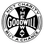
This was Goodwill’s logo from 1902-1968:
Courtesy of Logopedia
Don’t remember it? Me either; it was before my time. Goodwill’s new logo (see below) was designed in 1968 by Joseph Selame. Joseph was a really interesting fellow, I encourage you to read more about him. Joseph was a branding genius and designed a wide array of logos and brand identities for dozens of big time companies. He really nailed it with the goodwill logo. A timeless design that’s been around for 50 years, and will probably be around for another 50 years.
Courtesy of Logopedia
What Joseph was able to capture in this super simple design was goodwill’s positivity, and mission to inspire hope and self-confidence. Plus it, like the FedEx logo, has a delightful hidden symbol. What you probably see right away is half of a smiling face, right? However, upon closer inspection you’ll notice that it also forms a lowercase ‘g’, which he repeats in the lettering below. Genius.


