Evolution of a Logo: Edition 2 (The FedEx Logo)
For a brief introduction on Evolution of a Logo please read Edition 1.
Welcome to Edition 2. We’re going to take a look at the FedEx logo. Unlike the Nike Swoosh, it’s history isn’t as memorable, but there’s a certain coolness to it that most people don’t see right away…if ever.
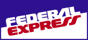
But before you get to see the cool you have to know a little about the origin. The original FedEx logo (then Federal Express) was created in 1973 by Richard Runyon. If you were around for the 80’s then I’m sure you remember this logo only because of it’s ubiquity, not because it was in any way cool (No offense Richard, the design just doesn’t have a timeless quality to it).

Okay, moving right along. The current logo was created in 1994 by Lindon Leader, who was a Senior Design Director at Landor Associates in San Francisco at the time. Unlike the Nike Swoosh, I can only imagine what this design must have cost FedEx, let’s put it this way- it was for an undisclosed amount. I couldn’t find it disclosed anywhere anyway.

What most people probably don’t see until it’s pointed out is the arrow located in the negative space between the E and the x. See it? Now that I’ve pointed it out, it’s probably the only thing you see. The arrow is meant to symbolize forward movement, speed and precision. The design is brilliantly simple.
Leader created over 200 designs before realizing he could create the arrow with those letters. He manipulated the two different type faces (Univers 67 and Futura Bold) to achieve the natural looking shape of the arrow. This chosen design was one of six finalists. Apparently during the presentation of the designs, the CEO, Fred Smith, was the only executive out of 12 to see the arrow right away.
So why is this logo so successful? The subtly of the arrow displays amazing discipline by designer and client. To have emphasized the arrow or made it more obvious would have been anticlimatic- like the guy who ruins the surprise party. But I think the creator says it best-
The power of the hidden arrow is simply that it is a hidden bonus. It is a positive-reverse optical kind of thing: either you see it or you don’t. Importantly, not getting the punch line by not seeing the arrow, does not reduce the impact of the logo’s essential communication. On the other hand, if you do see the arrow, or someone points it out to you, you won’t forget it. I can’t tell you how many people have told me how much fun they have asking others if they can spot something in the logo. To have filled in the arrow, or to somehow make it more visible would have been like Henny Youngman saying Please take my wife instead of Take my wife. Please. Punch lines that need to be explained are neither funny nor memorable.
~ Lindon Leader
For more Henny Youngmen jokes- Click here.
A special thanks to The Sneeze for the great interview with Lindon Leader.
Stay tuned for the next edition.
